Wednesday, October 21, 2009

For our next assignment, we were to take this website and do an interface design based upon three mediums. The mediums were a print ad, a photograph, and a classic movie poster. For this Assignment, I chose a "Singin in the Rain" movie poster, a picture of tulips, and a cell phone ad. Below are the reference pictures, the original snap shot of the website, and then my three versions of the website based upon the reference pictures.
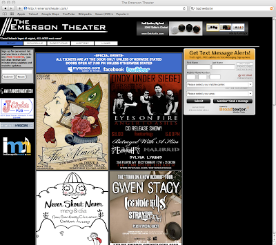


Original Website


The Print Ad
My version of the website based upon the print ad.


The photograph of tulips.


My version of the website based upon the photograph.


The Classic Movie Poster.
My version of the website based upon the classic movie poster.


Sunday, October 4, 2009

Final Illustration 2 - CGT 251

Here is my preliminary sketch for the next assignment. As you can see, I much prefer the finished product. :) I basically wanted to immulate a sea of the same thing of the numbing devices with little to no color to be void of feeling any emotion at all.


For our second illustration in the class I am currently taking, we had to make a "patterned" illustration using a word we drew out of a hat. My word was "numb". I wanted to be void of color or emotion. I placed vices people use to make themselves feel numb in a downward, eroded manner, hoping to persuade my audience that it is void of emotion, and a bit frozen or even dead like, hence -- numb.